
From packaging designs that tell a story to sports drinks going premium, we explore three designs aimed at appealing to the luxury consumer market
It's estimated that 60-70% of buying decisions made in the store (Credit: Shutterstock/Customdesigner)
Whether it’s catching the eye of the consumer or making it better to interact with, packaging designs can have a massive impact on the profitability of products.
This is partly due to the number of businesses competing for eyeballs and the way customers make purchases, with it thought that 60-70% of buying decisions made in the store.
One field where strong packaging design that stands out is critical is in the luxury goods market.
One of the biggest design agencies involved in the luxury packaging space is Pearlfisher.
Explaining the company’s design philosophy at Packaging Innovations’ 2020 Discovery Day, its head of realisation Jennifer Newell said: “We design for life.
“And for us, designing for life means understanding how people’s needs and desires are changing, so that we can design for their lives.
“By understanding how people are living their lives, and expressing that through brand design, we use our unique team of futurists, strategists, designers, and realisers.
“And we’re all observing, imagining, and expressing change constantly, and trying to make sure that everything we design fits with the future wants and needs of people that are buying products.”
NS Packaging explores three examples when Pearlfisher has implemented this philosophy in the design and branding process.
Telling a story through packaging designs
In October 2019, Arcus – Norway’s largest wholesaler of wine and liquor business – with the help of Pearlfisher launched a new range of dry gin.
Skagerrak Nordic dry gin range is a “uniquely crafted”, juniper-driven gin made from seaweed and botanicals found in the Skagerrak region of the north sea.
The Skagerrak stream is famous in viking history and is well-known among sailors and seamen who have used the north star and the three points of Norway, Denmark and Sweden to navigate these areas.
In order to convey the history of this region, Arcus asked Pearlfisher to tell its “elemental, seafaring and geographical story” through its packaging design.
Newell explained: “The brand story is immersed in the often unpredictable, challenging and colour changing waters of the scope or at sea, which is sometimes a bright turquoise blue and just as suddenly deep, blue and intense.
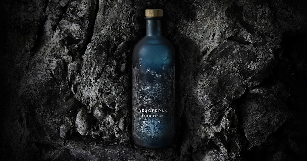
“So the colour becomes a key focus for the unifying equity for the design, giving us a distinctive bottle colour that we finished with a metallic glaze, and it gives changes to the different blue hues.
“It represents what’s happening in the Skagerrak sea in different lights and it conjures a vision of the sea and the night sky in that part of the world.
“Also, the three points as part of the logo on the front represent the stars and the navigation points, so it brings the whole brand story together.”
Added to that, its bottle cap is made of oak with a north star cut into it by a laser, which signifies “provenance and craftsmanship”.
Pearlfisher also included the brand’s story on the back of the bottle itself, in addition to other variants such as sea motif illustrations like seaweed to bring together every element of the brand.
Thanks in part to this work, the gin won double gold in the contemporary and premium categories at the 2020 Gin Masters competition.
Developing a ‘premium’ sports drink
The brainchild of nutritionist Zana Morris, Toniq was named, branded and designed by Pearlfisher in partnership with glass manufacturer O-I.
The sparkling coconut water drink was launched in March 2019 to challenge the “unadventurous sports drinks category”.
These ingredients were a major driving force as to how Pearlfisher designed its packaging and communicated the product to consumers, and had to break through the generic and prescriptive look and voice of the coconut water category.
It also aims to elevate the drink as a premium and progressive drinking experience, and an innovative sparkling coconut water.
Newell added: “The name Toniq hints at both, with the perceived benefit of an old fashioned tonic and also the super nutrient goodness of today’s key magnesium ingredients.
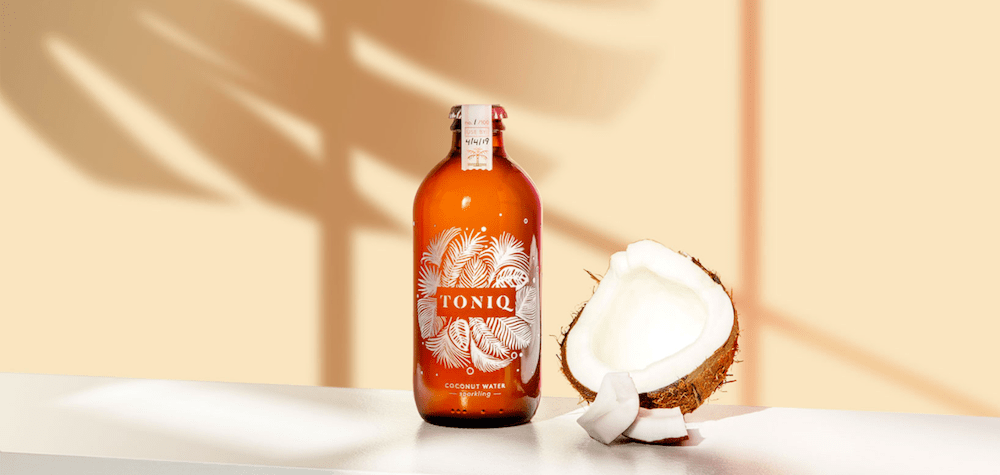
“And we used to AR on the top to cement the idea of the power to be found in this new and intelligent way of drinking coconut water.
“The expression itself, through a unique and embossed visual identity that symbolises the lighter nature of the drink and also creates some experience with a bottle in the hand because print is really tactile.
“We chose a recycled brown glass bottle because it naturally reflects the outer shell of a coconut and it cues a more crafted and premium feel when it’s supported with our choice of a rose gold cap.
“Functionally, brown glass is better at protecting the integrity of the drinking side, so it has a benefit from that perspective, but it’s also brilliant for sustainability as it’s made from recycled content as well as being fully recyclable.”
Designing packaging for the jewellery market
In July 2020, Pearlfisher partnered with jewellery company Tohum – known for its artisanal origins in Istanbul to a highly sought-after international fashion brand.
To portray its routes, the designers created contemporary fashion to complete an experience that takes the brand forward as a natural luxury brand.
Pearlfisher also wanted to create an intuitive brand experience that connects with the “elegant simplicity” of Tohum.
Newell added: “At the heart of Tohum is this timeless idea of connection, so the desire to bring us closer to our origins and to each other is part of the brand essence.
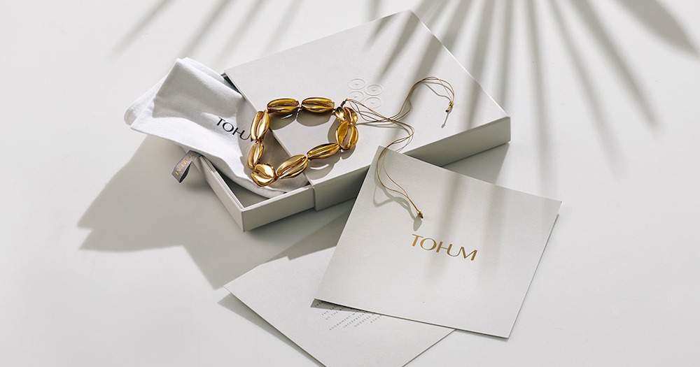
“Working in harmony with its design philosophy, we created an intuitive brand experience that connects with the elegance and simplicity of it and then opens up into an expressive world where the story can unfold, and all collections can come alive.
“Reflecting the originality of the Tohum designs, our brand mark brings together a sense of form and fluidity.
“The elegant lettering through its graceful posture and intertwining nature evokes a feeling of continuity, crafting a sense of space and light reflected in the choice in a natural white, charcoal, and gold palette.”