
Why the likes of Jack Daniel's, Marmite and Old Speckled Hen and other top brands have retained classic packaging designs throughout their history
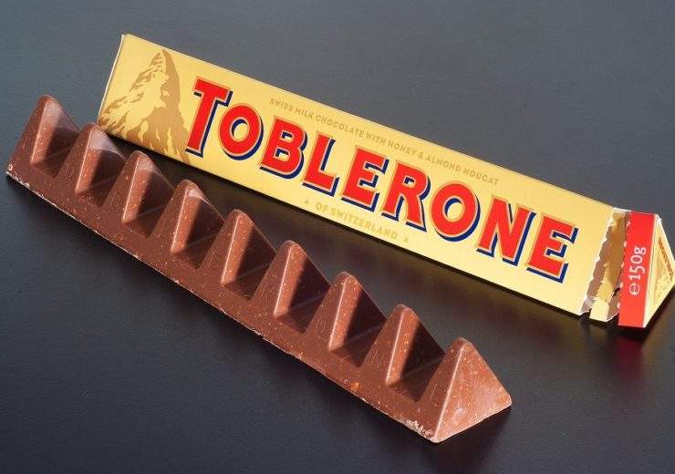
The name Toblerone is based off the last name of Theodor Tobler, one of the creators and the Italian word for nougat, which is torrone (Credit: Wikimedia/Ashley Pomeroy/https://commons.wikimedia.org/wiki/File:Toblerone_3362.jpg
As trends change, brands often adapt to suit their new cultural surroundings. But some stick to what they know, with the classic packaging design becoming intertwined in the fabric of the organisation.
Here, we look at some of the most iconic.
Examples of classic packaging designs
Jack Daniel’s
Founded in 1875 by Tennessee businessman Jasper Newton Daniel, the whiskey brand has built its reputation on being the image of 19th century America.
This branding is pronounced in its advertisement, with slogans like “56 men signed the Declaration of Independence, one man put it in a bottle”.
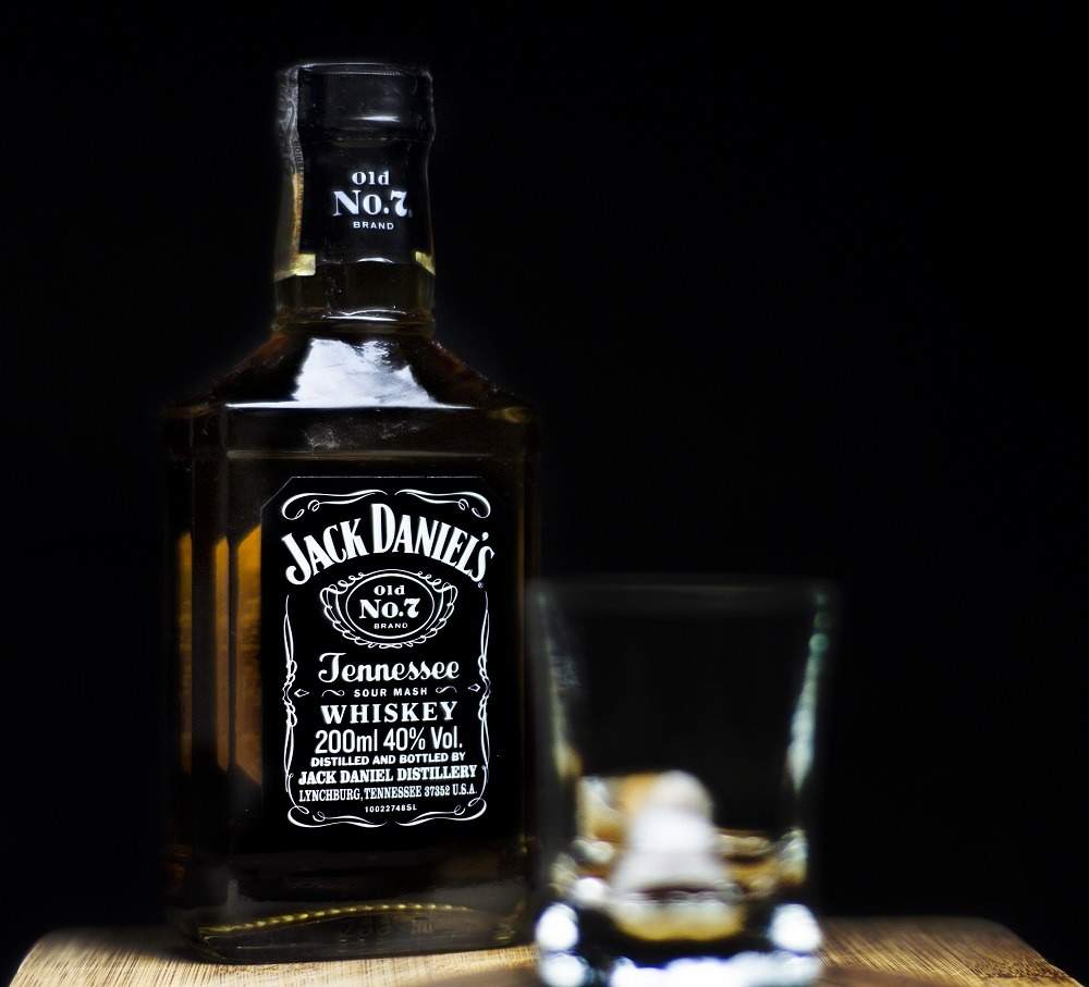
The glass bottle design, wrapped in its large black label and classic white font, is one of the most distinctive on the market.
It’s synonymous with the time period from which it originates and even sits alongside the cinematic view of the Wild West.
Twinings
The world-famous tea brand was set up in 1706 by Thomas Twining after he bought a coffee house in The Strand, central London.
Heritage seems to be something that is important to the company, with the descendants of Mr Twining himself still working as part of the organisation.
Stephen Twining, the tenth generation of the Twinings family, has the role as brand ambassador at the company – now based in Andover, Hampshire – since 1998.
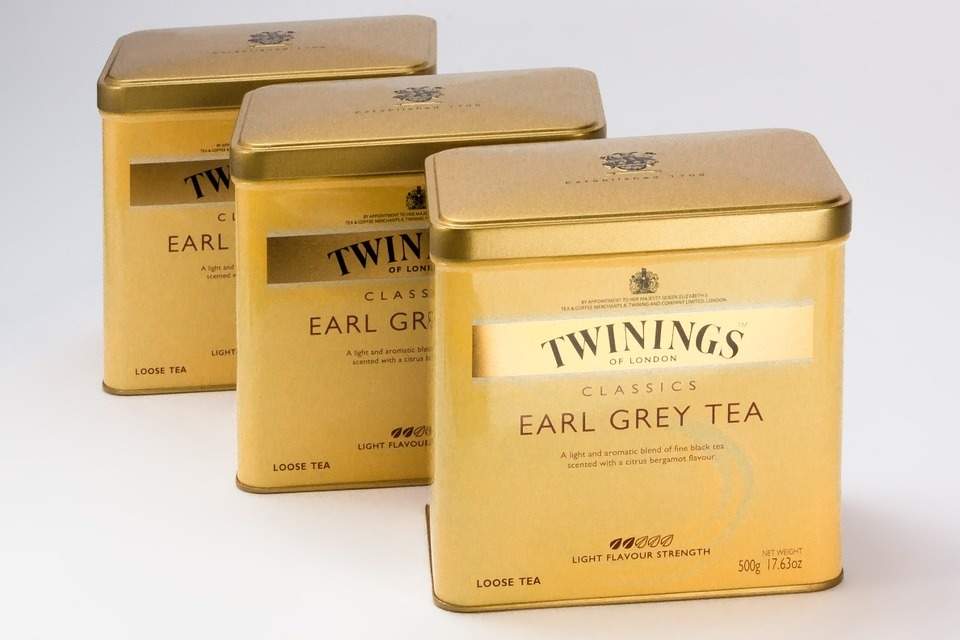
Although there have been some design changes to the tins and boxes in which the teabags are sold, at its core there is a straightforward theme that runs through the packaging over the generations.
The colours aren’t what many may describe as modern, with the Twinings of London logo used on packaging also featuring above the original tea rooms where the company began.
Lyle’s Golden Syrup
One of the most historic designs of all of the branding around, Lyle’s Golden Syrup’s appearance has barely changed since the inception of the company.
The company was founded back in 1881 by Abram Lyle, who built a sugar refinery on the Thames, in East London, and created Golden Syrup.
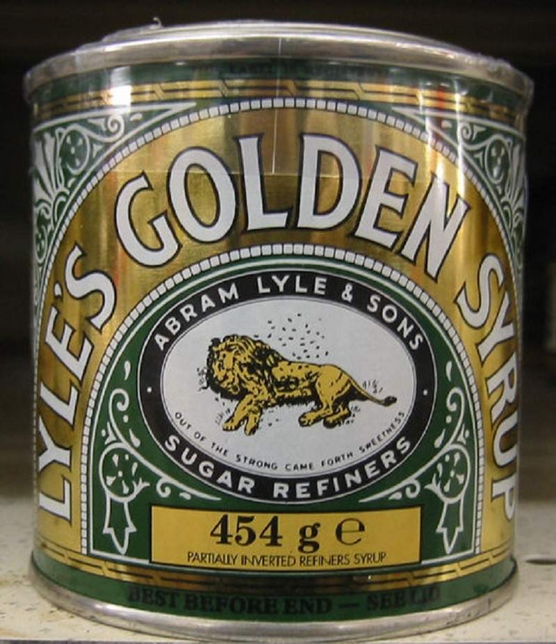
In 1883, Lyle created the company’s logo that has now become so synonymous with the brand. The image depicted Samson’s “lions and bees” from the Old Testament.
It’s so long-standing that in 2006 Lyle’s Golden Syrup became the holder of the Guinness World Records for the oldest packaging branding, with this being the case now for 134 years.
Old Speckled Hen
With a complicated history, the famous Old Speckled Hen became the ale that it is today in 1979.
The drink came into existence when the car company MG approached the Morland Brewery – which had been around since 1711 – to brew a special ale to celebrate the 50th anniversary of MG’s move from Oxford to the nearby town of Abingdon, where Morland Brewery was also based.
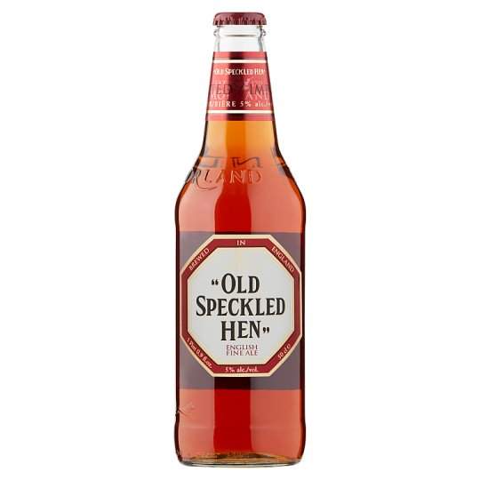
MG suggested the name Old Speckled Hen, in homage to the MG Featherlight Saloon, which was affectionately known as “The Owld Speckled’un”.
Since the creation of the drink, the Old Speckled Hen’s design hasn’t changed too much.
It features a transparent glass bottle with a label on the front bearing the logo in the shape of an octagon.
This is a similar design to MG’s logo, with the words “Old Speckled Hen” presented in capital letters and quotation marks.
Toblerone
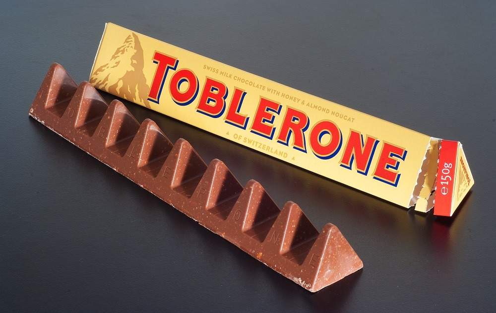
World-renowned Swiss chocolate maker Toblerone has an iconic status – largely due to the design of the bar itself, which hasn’t changed over its 111-year long existence.
It was first dreamed up by Theodor Tobler and Emil Baumann, who until then owned a sweet shop called Tobler & Cie in the Swiss capital Bern.
The unique triangular-shaped bar that has become so synonymous with the Toblerone brand was thought to have been designed to reflect the Matterhorn in the Swiss Alps – the mountain found on the Toblerone packaging.
But according to the sons of Mr Tobler, he actually based the design on the pyramid shape that dancers made at the Folies Bergères cabaret hall in Paris.
Although there have been some changes to the design over the years, there have been a few things that have remained constant ever since the inception of the Toblerone in 1908.
First off, the triangular prism packaging shape of the Toblerone has never changed.
Alongside this, the golden-coloured background of the packaging and red “Toblerone” text have remained the same right from the very start.
The first appearance of the Matterhorn on the Toblerone packaging came in the 1960s.
Marmite
Like one of the most divisive food products on the market, consumers will no doubt either love or hate Marmite’s jar design.
Invented by accident, this most British of staple spreads was in actual fact created by German scientist Justus Von Liebig who, while brewing yeast, found that it could be concentrated, bottled and eaten.
The Marmite Food Extract Company was founded in 1902 in Burton-upon-Trent, Staffordshire, and was so successful that in 1907 the firm opened up a second factory in Camberwell Green, London.
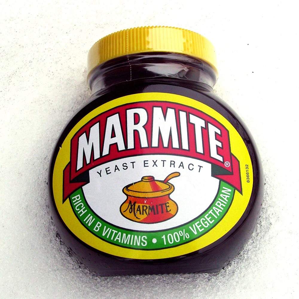
The history of the packaging is almost as distinctive as the product that is inside it.
Until the 1920s, Marmite was supplied to its customers in clay pots. After this, however, it changed to the iconic look that we love or hate today.
The look of the Marmite packaging hasn’t changed over the years – a transparent jar with the bulbous glass shape and a yellow label adorned by the word “Marmite” in bold lettering.