
Looking to create a more distinctive positioning for its Somersby Cider brand, Carlsberg approached design agency Elmwood Leeds for help
The new design follows the 'refreshingly optimistic' mantra (Credit: Elmwood Leeds)
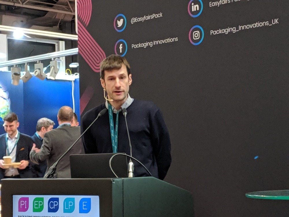
In 2019, drinks manufacturer Carlsberg approached design agency Elmwood Leeds to redesign the packaging of Somersby Cider. The studio’s associate creative director Robert Skelly discussed how they set about rebranding the beverage company.
In 2018, the global cider market was worth an estimated $4.3bn.
With this figure expected to grow over the next five to six years, possessing a stand-out brand identity is vital for success.
As one of the newer ciders in the marketplace, Somersby’s need to create a distinctive look and feel was even more crucial.
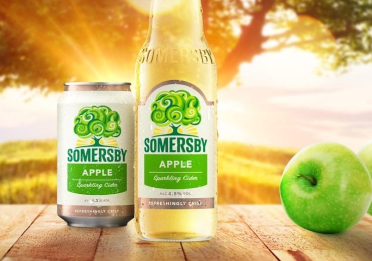
Launched in 2008 by Danish alcoholic beverage brand Carlsberg, Somersby’s apple tree brand identity was part of a common theme traditionally used by many ciders — leaving it part of an already crowded marketplace.
To create a more distinctive positioning for its brand, Carlsberg approached design agency Elmwood Leeds for help.
Talking about the commission at this year’s Packaging Innovations conference at the NEC in Birmingham, the studio’s associate creative director, Robert Skelly, explained that “it was hard to literally see the forest for all the generic apple trees” in the cider market.
He added: “There was a lot of this cut and clutter approach to design with a lot of the use of generic apple trees, and Somersby was getting lost in the mix.”
Borrowed vs distinctive memory structures in brand design
When design teams at Elmwood Leeds work on a branding or rebranding project, they first look into how they can utilise the phycology of borrowed and distinctive memory structures.
A borrowed memory structure means images that already have well-defined shapes with established meanings, such as coins and signatures.
Skelly explained that brands use this because “it establishes the quality of the product, to give us that reassurance that what we’re going to get is familiar”.
He added: “It seems trustworthy. The downside to that is it becomes very generic.”
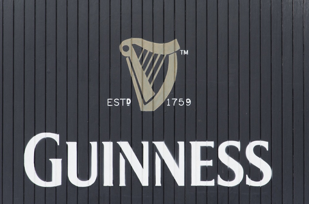
On the other side of this are distinctive memory structures, — shapes and styles that have an established brand identity, such as the Guinness’ harp, the McDonald’s “M”, or Nike’s tick.
Skelly said: “The problem is distinctive assets need to be learnt over a longer period of time.”
For Elmwood to conduct the rebrand, the design team wanted to look for the solution by using borrowed memory structures — such as the traditional apple tree, but making it look distinctive.
The new logo also had to embody Carlsberg’s new vision for Somersby, by creating a culture of optimism around the brand.
Turning Somersby’s packaging into something that’s ‘refreshingly optimistic’
To adhere to this change in direction, the design team at Elmwood came up with the “refreshingly optimistic” brand proposition.
Skelly explained: “Every touchpoint that this brand would do going forward would have to ladder up to this idea of being refreshingly optimistic.”
The first thing the team wanted to do was to reestablish the Somersby logo.
Part of this redesign was to stick with the traditional iconography of the apple tree, but finding a way of making it look distinctive — in-keeping with the “refreshingly optimistic” brand mantra.
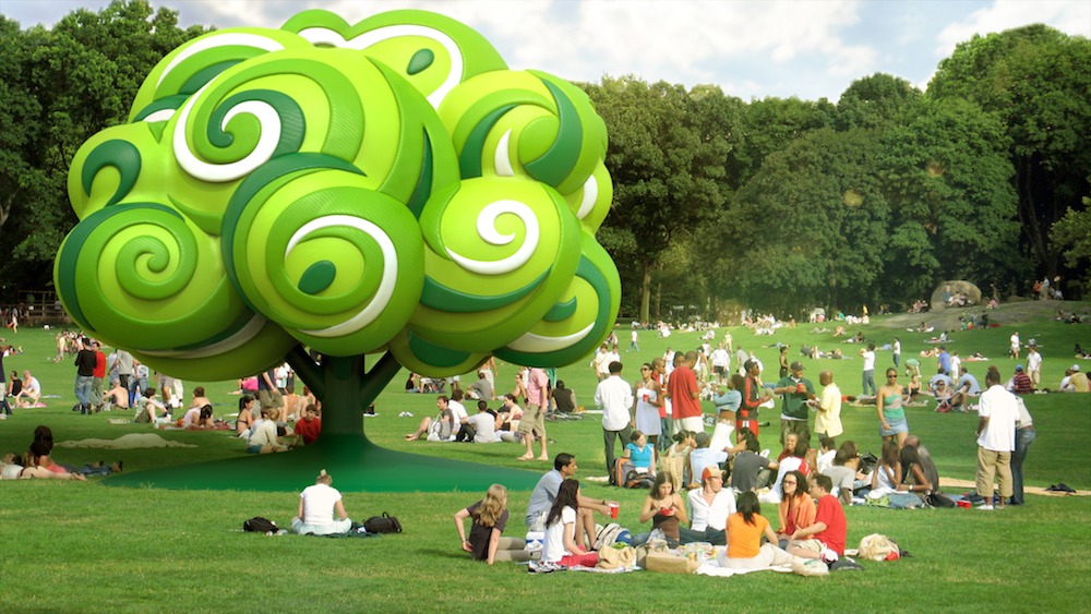
Skelly said: “We did that by creating the ‘living tree’.
“We moved away from the generic apple tree that a lot of the other brands were following and doing something that was a bit more fun, playful and lighthearted, and something that appealed to this idea of optimism.
“We did this by introducing brighter, fresher greens, bringing in swirling shapes on the trees — which is designed to introduce this idea of togetherness.
“We also debated for a long time whether we should keep the ladder or not.
“Ladders, to me, represent hard work — you have to climb the tree in order to pick the apples, and that’s not what this brand was about anymore.
“The brand was about coming together and relaxing, and the tree almost becomes a beacon for people to gather around and drink together.”
Instead of the ladder, the designers decided to “recraft” the tree trunk, making it feel more uplifting so that it’s “almost got its arms open” to make the logo seem more welcoming.
Creating consistent brand identity through logos
Another problem the design team looked to address was how Somersby differentiated its flavours.
Before Elmwood’s rebranding, Somersby did this by changing the bottle’s colour.
Skelly said: “The problem with this is that, eventually, you’re going to run out of colours, so it’s very hard to future-proof the brand.
“So we needed something that would give that longevity.”
The design agency did this by embracing the idea of the “living tree” again, defining different images through a drink’s ingredients.
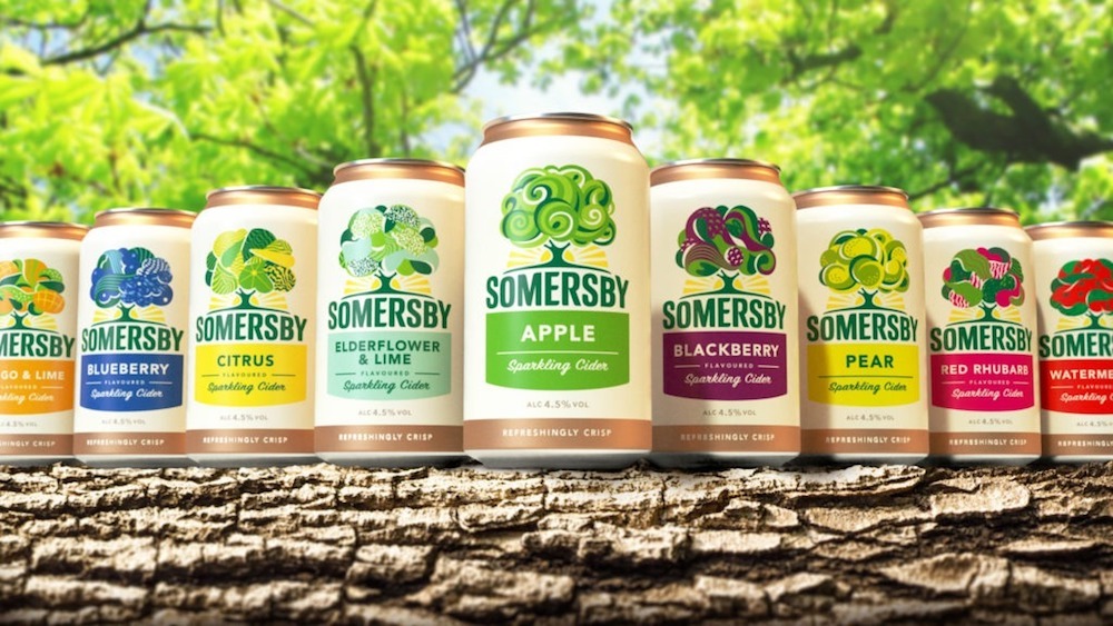
For example, incorporating sharper shapes on the logo of the lemon-flavoured cider to denote the sharp taste of lemons.
Another factor for this decision was that it allowed Somersby to establish a “brand silhouette”.
Skelly explained: “The shape of that tree never changes,
“This is because that’s the thing that needs to be distinctive and stand out on the shelf in a supermarket or in a bar, you need to be able to recognise that silhouette.
“That’s the fixed side of the design, the flex side is what happens inside that tree.
“So all those illustrations and the colours bring each one to life, so you can spot those ciders, and then you can select your flavour quite easily.”
Using packaging design tell a story
The rebranded logo has been utilised across a range of marketing campaigns by Somersby, including being used at festivals or on pop-up Somersby vans.
Alongside this, Somersby’s redesigned bottles have been shared around on social media, with some even being painted and put online.
Its international suppliers market the cider in different ways — such as in Asia, where the drink is seen as a much more luxurious beverage.
Skelly explained: “So its almost like we’re creating the guidelines for them to really engage and tell stories through this optimistic idea.
“Whether it is a pop-up van or photo booths where people can come together and share those moments, or even a magician at a garden party, just telling those stories.
“There are lots of different ways that we can tell those stories, and the packaging becomes the catalyst for that.”
Somersby’s sales have also gone up since the new design was launched, with a 12% increase in the first quarter in Germany, and a 13% jump in Poland.
Skelly said: “It’s very early doors, but we’re already seeing a massive shift from where they were at the beginning with that kind of generic, safe design to something that is a bit different and a bit disruptive.”