
Created by Starbucks talented design team and still the same delicious coffee our customers enjoy, each packaging redesign tells a unique story about the coffee roast’s origin and tasting notes
Starbucks designers updated the illustration style to be artful and sophisticated. (Credit: Starbucks Corporation)
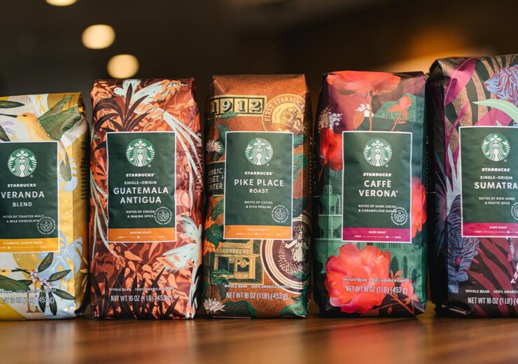
For the first time in 10 years, Starbucks is debuting new whole bean coffee packaging designs inspired by the people, moments and experiences associated with each blend. Created by Starbucks talented design team and still the same delicious coffee our customers enjoy, each packaging redesign tells a unique story about the coffee roast’s origin and tasting notes.
Starbucks Veranda Blend
Starbucks has spent decades working with coffee farmers throughout Latin America. This blend was inspired by the lightly roasted coffee sipped together over the years, often enjoyed on a breezy veranda with a view of lush coffee trees. Subtle but flavorful with notes of toasted sweet malt and milk chocolate, it’s an inviting, approachable coffee that mixes beautifully with milk.
“This art is intended to transport customers to a lively veranda in Latin America, giving a tangible sense of the coffee’s origin,” said Yumi Reid, said Starbucks designer and illustrator. “We wanted the design to reflect Starbucks Blonde Roast story through use of color: roast color is primary, supported by house green on the hummingbirds. Bright accent colors on foliage further highlight this amazing coffee’s story.”
Starbucks Single-Origin Guatemala Antigua
In Antigua Valley, coffee is a family tradition and a point of pride. Generations of farmers have worked the rich volcanic soil, perfecting their craft and producing some of the finest coffees. A favorite since Starbucks beginnings in 1971, this coffee is rich and refined, with elegant notes of dusted cocoa and soft spice.
This coffee’s heritage is featured through the quetzal bird amidst plant life from the Antigua region. Starbucks designers updated the illustration style to be artful and sophisticated, using layers of texture and delicate linework to create depth and detail throughout the design. The colors are shifted to warm coppery tones, speaking to the coffee’s roast and lending a beautiful shimmer.
Starbucks Pike Place Roast
Named after Starbucks first store in Seattle’s Pike Place Market, this coffee is served fresh every day in Starbucks stores around the world. A smooth, well-rounded blend of Latin American beans with subtly rich flavors of cocoa and praline. It’s the perfect brewed coffee – a consistently delicious cup customers can really look forward to. Enjoy the spirit of Pike Place in every sip.
“In undertaking this design, we sought to leverage recognizable design elements and our brand’s history at Pike Place. To accomplish this, I utilized motifs from our heritage in a style reminiscent of travel luggage stickers and badges,” said Bridget Shilling, Starbucks designer and illustrator. “While the bag celebrates our history, I wanted to ensure the design is still grounded in coffee, so coffee plants are interspersed throughout. We use printing processes to ensure the copper hues will come to life for a warm, metallic effect.”
Pike Place is a registered trademark of The Pike Place Market PDA, used under license.
Source: Company Press Release