
The newly redesigned logo and product packaging refreshes the company's brand, offering a cohesive strategy at retail across all channels.
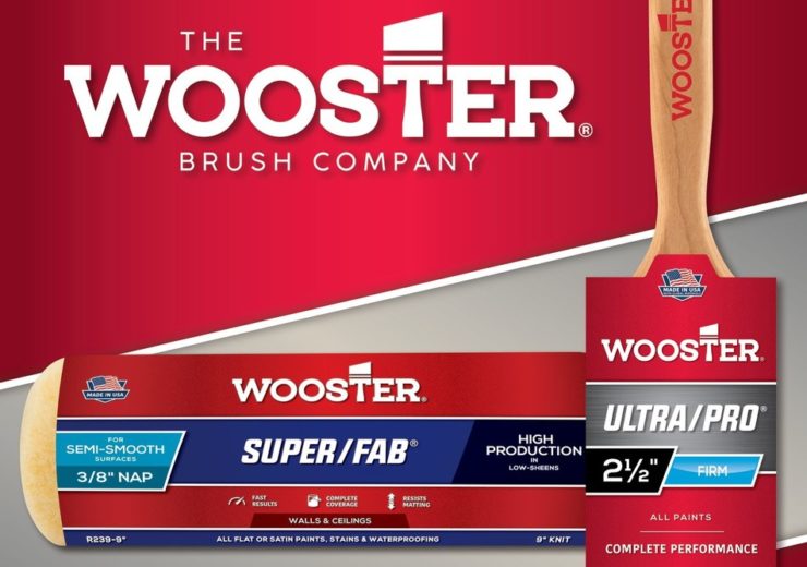
Image: The Wooster Brush company redesigned logo and product packaging. Photo: courtesy of PR Newswire Association LLC.
The Wooster Brush Company has just announced a newly redesigned logo and product packaging that will hit shelves early next year. A leader in paint applicator innovation, Wooster has been developing tools designed to meet or even exceed the needs of painters for nearly 170 years. This new look refreshes the Wooster brand, offering a cohesive strategy at retail across all channels. The campaign launching to announce these elements is, “Same Great Product, Bold New Look.”
“From its beginning, Wooster has made great quality products and that remains the same today,” says Ben Maibach, Vice President of Sales at The Wooster Brush Company. “But, we were seeking ways to better tell our story. We want people to instantly recognize Wooster products and to also understand why to choose Wooster over everyone else—for quality, performance, and results. We believe this new look achieves just that.”
The new design boldly embraces red—the company’s primary color. Newly established icons better communicate the key features and benefits of each product. Most notably, the new Wooster logo incorporates a paintbrush into the mark, evoking heritage of the world’s first angle sash brush which was introduced by Wooster in 1937.
Wooster products will begin shipping in the bold, new packaging style starting January 1, 2020.
Source: Company Press Release