
Seabrook unveils bold new packaging to boost consumer appeal
Seabrook unveils bold new packaging to boost consumer appeal
Seabrook Crisps has revealed a bold and bright new packaging design as part of an exciting rebrand for the Yorkshire based manufacturer.
Following extensive consumer research the packaging changes are part of a wider brand refresh, which aims to strengthen Seabrook’s market position and appeal to a wider consumer base.
The fun new look reflects the crisp maker’s bold, innovative spirit and the unique design ensures the packets will really stand out on shelf. Research supports the company’s belief that the change will attract new consumers, while continuing to please existing loyal customers of the brand.
As Britain’s original crinkle cut crisp, Seabrook Crisps has over 70 years’ worth of experience. The brand has become loved by fans all over the country for its flavours, such as Sea Salted, Beefy and Canadian Ham.
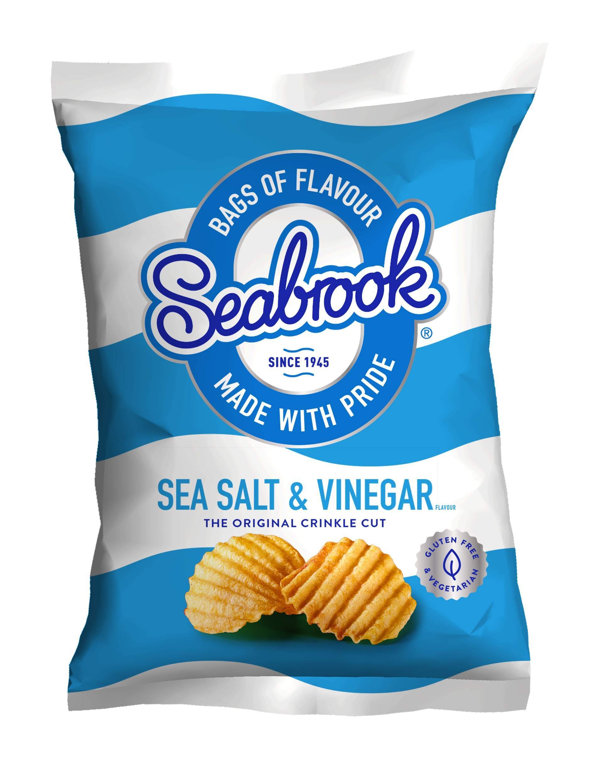
From bright pink to luminous yellow, the striking colours reflect the bold flavours Seabrook Crisps is renowned for. The Crinkle Cut adopts a wavy pattern to mirror the crisp profile. The eye-catching patterns are sure to position the brand as contemporary and courageous and will increase the brand’s relevance and accessibility in the modern fast moving impulse market.
The packaging also emphasises the brand promise “Bags of flavour, made with pride”, replacing the previous “Lovingly made in Yorkshire”. This change ties in with the Bradford-based brand’s focus on quality and flavour, which research reveals are the main reasons for loyal customers choose the Seabrook brand.
Kevin Butterworth, Marketing and International Sales Director at Seabrook Crisps, said:
“We’re very excited about this rebrand and it’s a real turning point for Seabrook. Working with Robot Food, we believe we’ve captured the essence of the brand in a unique and distinctive design, which will undoubtedly attract the attention of a new audience, while still staying true to the enduring heritage of the brand.
“The new designs reinforce what the brand stands for. We’re known for our bold flavours and we want our packaging to reflect this. We carried out thorough market research and tapped into consumers’ opinions to find out what would position Seabrook ahead of our competitors.
“It’s a great change for Seabrook Crisps and one we’re extremely proud of. Our existing customers are the backbone of this brand and we hope this fun, bold and creative design will encourage an even wider audience to opt for Seabrook.”
New outer case designs also ensure stronger stand out and shelf appeal for the Cash and Carry Packs. All major multiple retail stock will continue to be delivered in shelf ready packaging.