
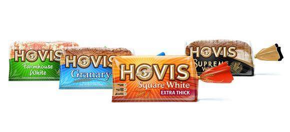
The latest Hovis packs feature a new logo image inspired ...
Hovis’s bread packaging has gone back to its roots with its latest graphic design by Jones Knowles Ritchie (JKR).
The Hovis name derives from the Latin “HOminis VIS”, meaning “strength of man” and the logo features an “iconic” hand and wheatsheaf image in a style inspired by the enamelled signs that used to hang from bakery shops.
JKR says the revised branding will “unify the Hovis portfolio with an easily identifiable, consistent image across the entire product range”.
Marie Davies, senior brand manager, Hovis, says: “JKR has produced a fresh design, while retaining the strong heritage of the Hovis brand.”
Alcan printed and produced the packaging for brand owner RHM.